
Choosing the right colour for your custom furniture can make or break the entire space.
While it’s easy to get drawn into trends online, what actually works in real homes is often very different. Lighting, layout, and surrounding materials all play a role, and what looks good in a showroom doesn’t always translate once installed.
At CM Furniture Design, we work with clients across Melbourne and see first-hand which colours hold up over time, and which ones people regret.
This guide breaks down what’s working right now, and just as importantly, what to be careful of.
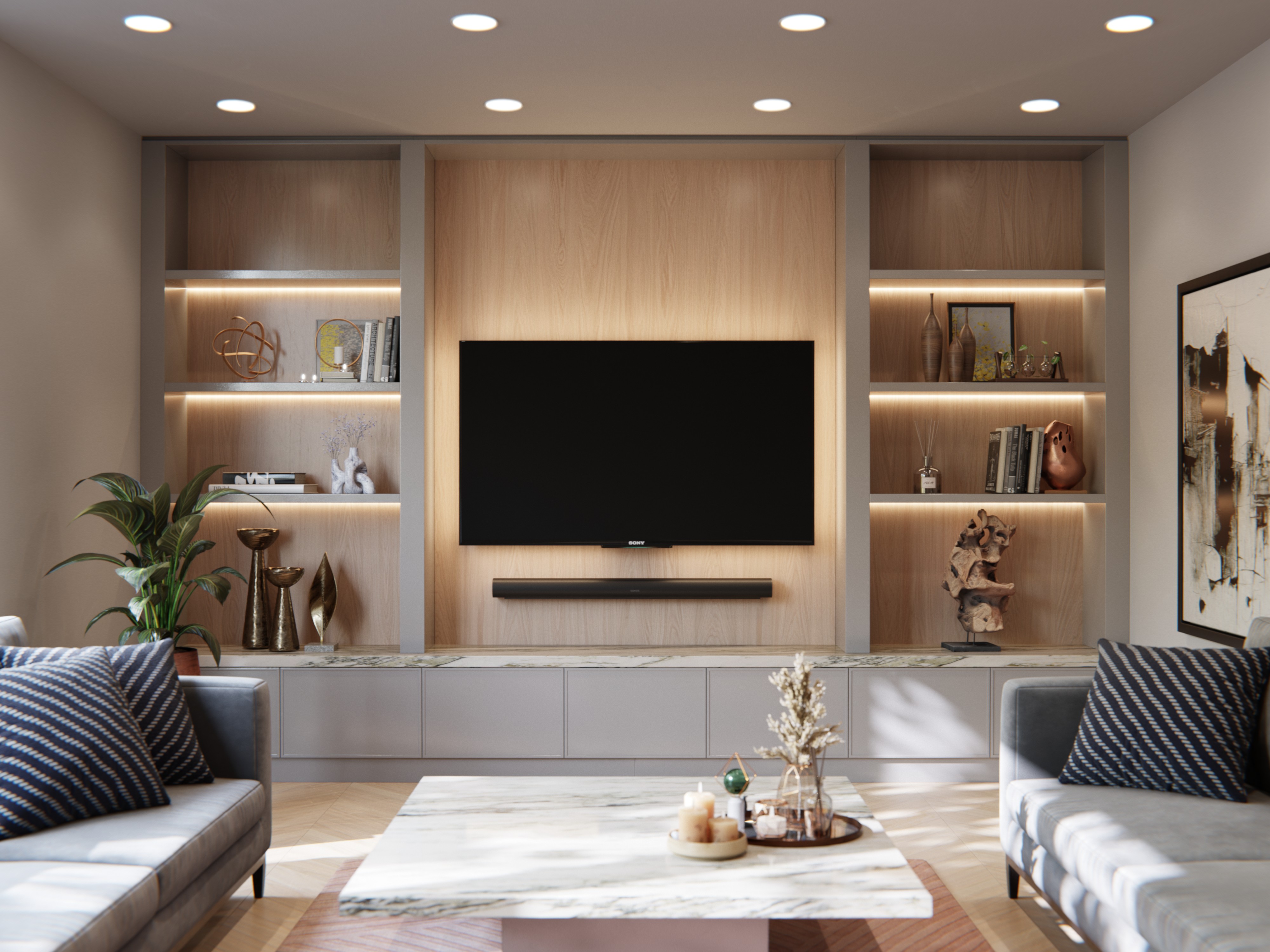
1. Warm Whites (Still the Safest Choice)
Unlike stark whites, they soften the space and work better with timber flooring, natural light, and warmer interior palettes that are common in Melbourne homes.
Why it works:
-
Timeless and flexible
-
Makes spaces feel larger and brighter
-
Pairs well with timber and stone
Watch out for:
-
Whites that are too cool or blue-based
-
Clashing with warm flooring or wall colours

2. Natural Timber Tones (Growing in Popularity)
There’s been a strong shift back toward natural timber finishes, particularly American Oak and similar tones.
These add warmth and texture that painted finishes can’t replicate.
Why it works:
-
Adds natural warmth
-
Works across modern and traditional interiors
-
Ages well over time
Watch out for:
-
Going too dark in smaller spaces
-
Overusing timber without contrast

3. Soft Greens (Subtle, Not Statement)
Colours like sage or tones similar to Polytec Oasis Green work particularly well when used thoughtfully.
Why it works:
-
Adds colour without overwhelming the space
-
Feels calm and grounded
-
Works well with timber and brass
Watch out for:
-
Going too saturated or bold
-
Using green across every surface
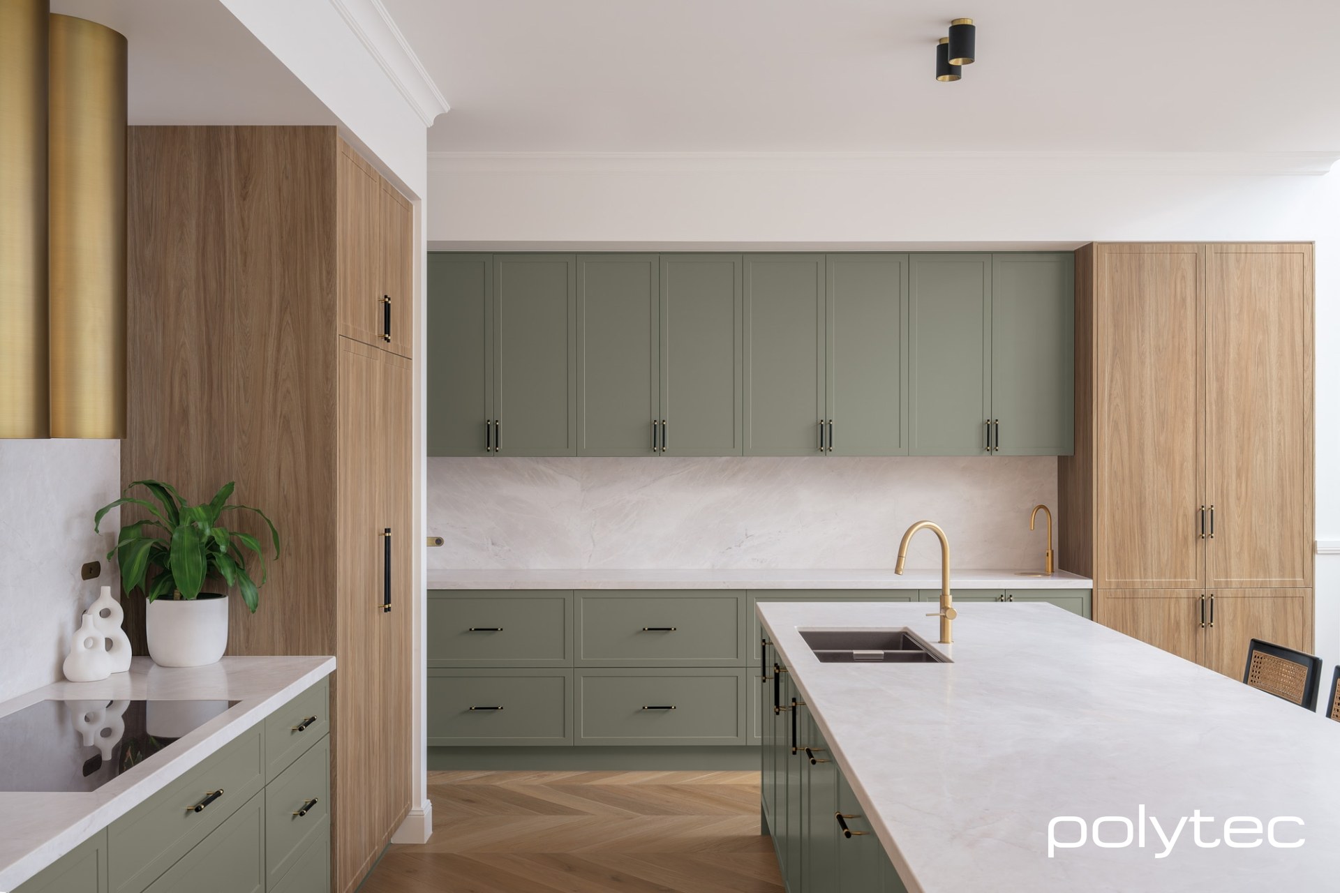
Reference: Polytec Australia
4. Dark Tones (Used Carefully)
Darker colours like charcoal, deep brown, and black can look incredible when used in the right setting.
We often use these as feature elements rather than across entire spaces.
Why it works:
-
Creates contrast and depth
-
Feels high-end and architectural
-
Strong visual impact
Watch out for:
-
Making smaller rooms feel closed in
-
Showing fingerprints and dust more easily

5. Two-Tone Combinations (Where Design Really Matters)
A common approach we use is pairing timber with a neutral painted finish to balance warmth and simplicity.
Why it works:
-
Adds visual interest
-
Helps break up large joinery units
-
Feels more considered and custom
Watch out for:
-
Poor proportions between colours
-
Clashing undertones

What Colours to Be Careful Of
This is where most mistakes happen.
Trends come and go quickly, but custom furniture is something you live with for years.
Colours to approach carefully:
-
Very bold or saturated tones
-
Cool greys that can feel flat or dated
-
Trend-driven colours that don’t match the rest of the home
What we often see is clients initially drawn to something bold, but after seeing it in a full render, they shift toward something more balanced.
Why Colour Looks Different in Real Life
One of the biggest surprises for clients is how different colours look once installed.
This comes down to:
-
Natural vs artificial lighting
-
Surrounding materials
-
Room size and layout
A colour that looks great on a sample can feel completely different across a full wall of cabinetry.
See Your Colours Before You Commit
At CM Furniture Design, we don’t leave colour decisions to guesswork.
Our Design Service allows you to see your furniture in your space using photorealistic 3D renders before it’s built.
This is where most decisions become clear, and often where clients refine their choices to get the best possible result.
The Design Service includes up to three iterations, so everything feels resolved before production begins.
Start Your Custom Furniture Project
If you’re planning custom furniture in Melbourne and want help choosing the right colour for your space, get in touch with our team.
We’ll guide you through options that not only look good, but work long-term in your home.